Avalon Cooms

It was not just redesigning and simplifying Discord UI but creating an online experience that can sustain a growing online Society of smart people from across the map.
⏰Time: 2weeks, 👨🦱 Team: Solo work, 💌Reach out to me
Problem Statement: Augment the app interface with the features of the Meta Discord server while ensuring that the interface is more intuitive to a new user who may not have familiarity with an app like Discord.
Process:
- Download the Meta app and familiarize yourself with how it works. Take screenshots and document them to be able to map out the journey.
- Join the Meta Discord server to familiarize yourself with the community and develop an understanding of the interface, users, and their behavior.
- Conduct a heuristic evaluation to test the Discord server and identify potential features that can be migrated to the Meta app and eliminate/simplify features that overwhelm or confuse a first-time user.
- Research chat and feed interfaces to find examples, references, and best practices.
- Make any UX diagrams you deem necessary to get a good grasp over what the user experience looks like and can look like.
- Extensively wireframe and map out the different screens.
That was a brief sum-up of what I got in Problem Statement and now we will unfold the mystery of how I created an Experience of Virtual Campus on just a mobile screen ( and how I came up with that name 🤭)
Few interesting points why I picked this problem!
- I’ve been on this server back when it started ( hence that “ Early Avalonian” tag 😬). So all this time was enough to make me comfortable in this eco-system
- After using Discord for quite a long time so I was aware of how this app works and are the few of the things that can be done in order to personalize this server ( As it was lacking some features that are exclusively needed from the server and differ in variety depending upon the server/ community needs)
- Almost spending time on a daily basis in voice chats ( sometimes in text channel) and interacting with old people, newbies and admins I realized the different types of problems that were faced by different categories.
How I started:
- Use Avalon Meta to discover how its existing features work and familiarize me with the existing interface, good sides, and bad sides.
- Having an interview with multiple people from the server based on when they have been using this server ( got in a conversation between somewhere of 70–100 people to know their side).
- Roaming around various channels to discover what happens in each channel depending on time and people online.
- Compiling all the problems they have been facing and features that thought can be a good add-on.
- Going through various UI redesign of discord that has been done already.
Let's start our journey of creating a virtual campus
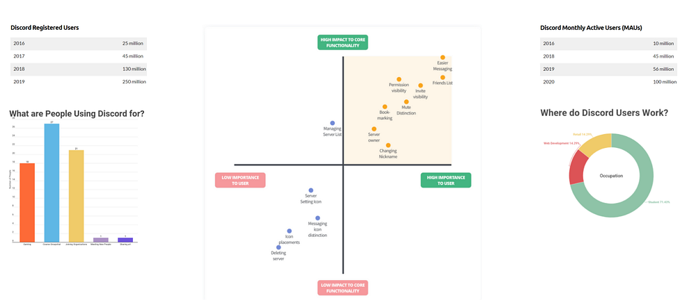
Secondary Research
- The foremost task was to discover why Avalon’s community grew so much on discord as compared to its telegram server.
- This has to be done why researching and gathering data on what discord has done right which no one else is doing as of now and has maintained their lead for a long time.
- Discord’s strength lies in 2 critical factors:
- Ability to handle thousands of server communications without glitches.
- A multi-platform support namely web, standalone app, phone.
Takeaways to Replicate in Your Business From Discord Growth
- Your brand must resonate with your audience
- Invest in incremental innovation.
- Join forces with the right partners.
- Engage and grow your community.
- Crushing the barriers to product adoption.
Primary Research
- As discord has been existing for a pretty long time and the team over there has given the design enough to make it simplified over time, but still, a lot of people don’t get used to the user flow very quickly because of so many features available being up-front.
- Me being on the server for a pretty long time had already established a connection with few admins and a lot of OG people, not to say that as I’m a talkative person made me talk to a lot of newbies and getting introduced to the problems they have been facing since joining.
Problems they faced (Including me sometimes )
(This was done in an interview format but converted into this format to understand their point easily)
Newbies
- The complex user interface of discord.
- Navigating through various channels.
- Not understanding the rules ( or not reading them 😒).
- Not understanding the concept of ava coins.
- (few of them were just frustration).
Early Members
- Encountering many new people who haven’t read rules and don’t know how to use discord and helping them without anything in return ( because newbies don’t know how to use Ava coins) 🤦🏽♂️
- Missing out on some important events.
- Not knowing which of their friends are surfing in Avalon’s server.
- Being lazy in sending Ava-coins because sometimes that seems to be a lot of work.
Admins/ Founders
- Managing jerks/ people who create a nuisance and disrupt productive conversations.
- Newbies being quiet and not engaging in conversations.
- Not being able to manage channels when a lot of people are online.
After noting down all the problems they have faced so far and some missing features they think should come in really handy and might just improve the feel of this online community, I started crafting solutions to these problems into way more simplified designs that are easy to use for everyone.
🧠Information architecture:
- The information architecture of apps like discord needed to be dumb down as there were a lot of features that a normal user might never use.
- But still preserving those which might come in handy and placing them into a new place which will make the user experience a little simpler and easy to navigate through.
- Now we will start with user flow
👨User flow :
(don’t get overwhelmed 😌)
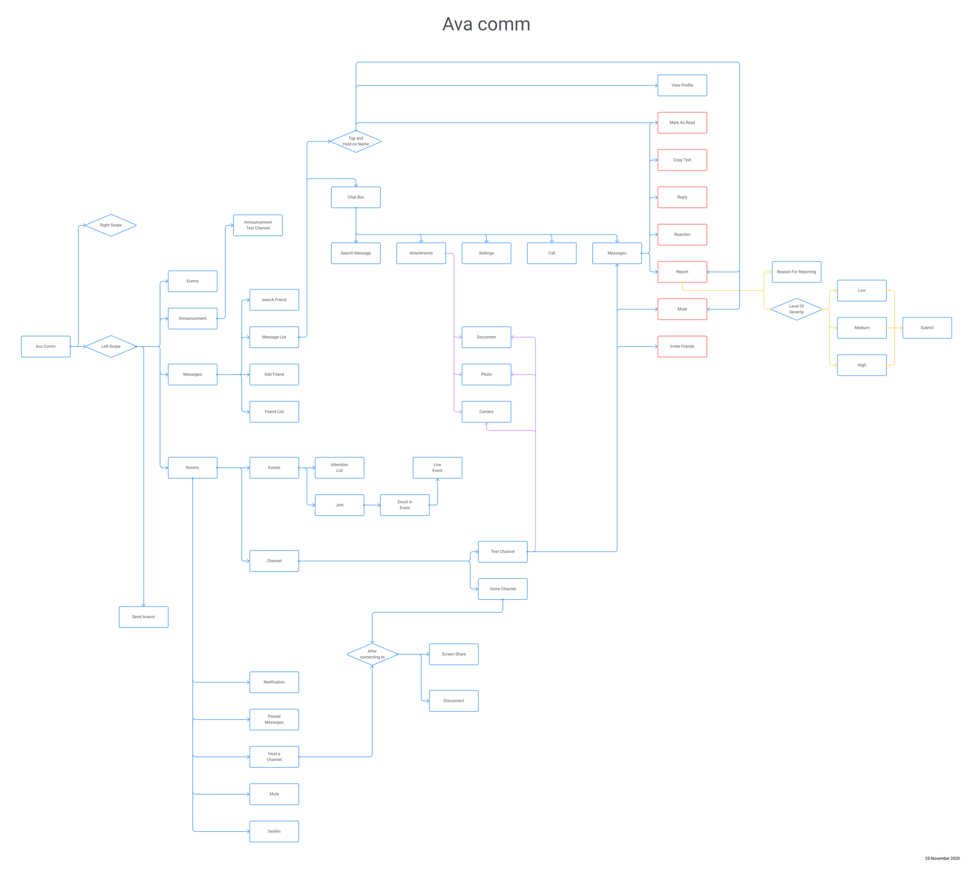
- And yes I've tried to make it even simpler by clubbing some common function in the user flow.
- Features needed to be re-arranged as it wasn’t just a discord re-design but making an app which is inspired but with features that are required by the community plus some exclusive ones but with also the ones that will help in further growth of community and user base.
- Points were kept in mind while designing user-flow and wire-frames that were raised while I had conversations with community members.
- After finalizing user flow I started to work on wire-frames (getting into the visuals now 😋)
✍🏼Wireframing

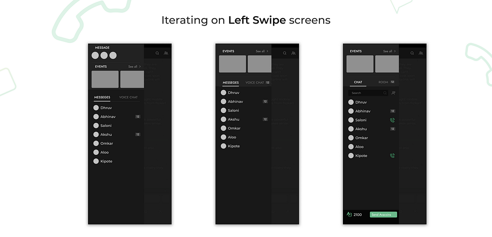
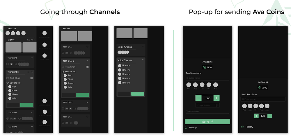


Damm, a lot of wireframes already. There are plenty more but before you get impatient let me show you the Final Visuals.
(Enjoy your 1min scroll through awesome visuals which took me 10 days to create 🥰)
It was a long scroll so far! take a break before we start with the thing you all came for ☕
🎉Visual Design


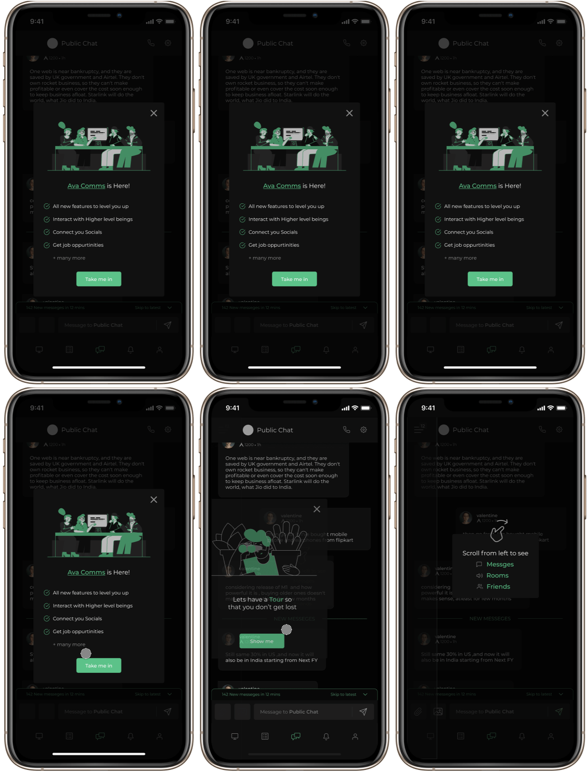


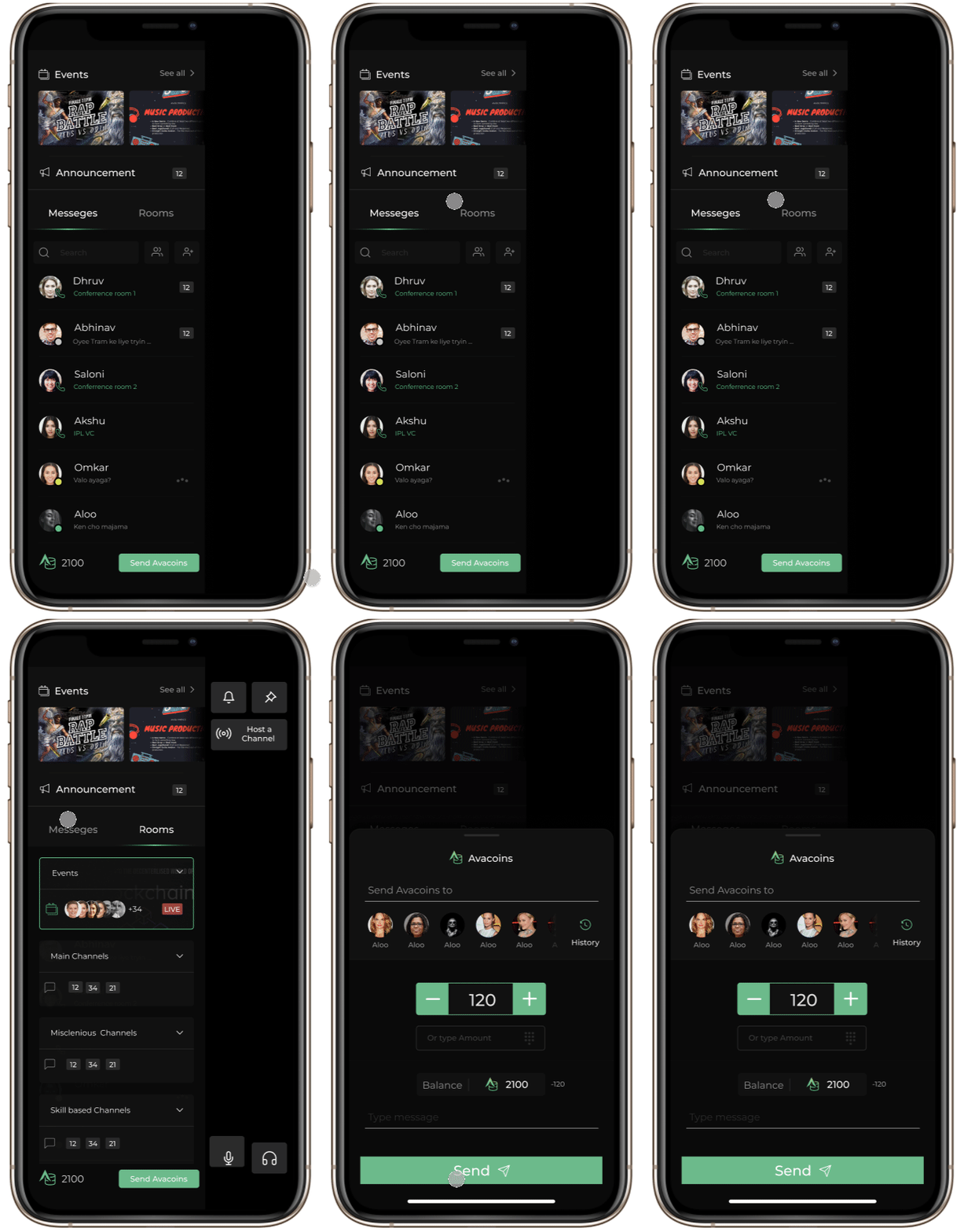


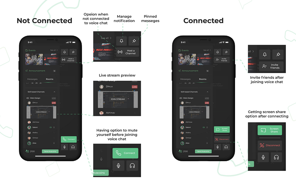


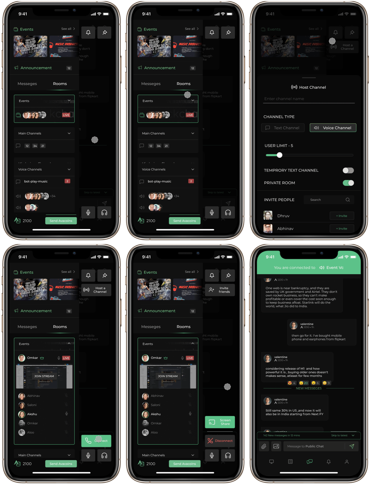


We are almost there, hold with me!
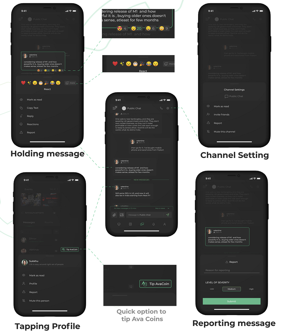
- for doing so in the previous platform was a lot of hustle with having a complicated user flow like
- Find money channel which was already fitted between a lot of channels
- Then you’ve to type a command for the bot in order to send money that being “!send <amount of coins> <receivers user name> “ as you might have guessed it by now that it was a lot for someone who is new to discord and to this server, hence resulting in a slight reduction in the money flow system.


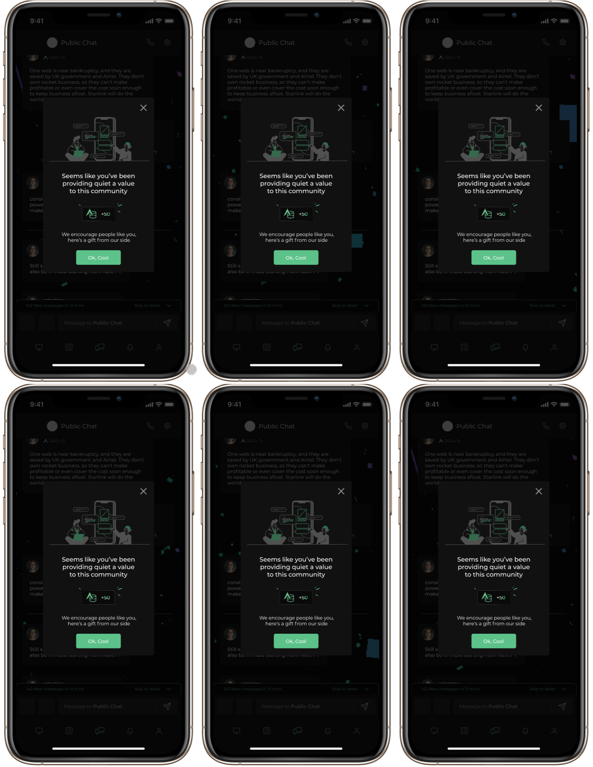


So how I came up with this name is a combination of “Communication”+ “Rooms” = “Cooms” 😬
(For a final comparison kindly refer to the original notion doc! you’ll see surprised at the amount of scroll that has been reduced)
📔Learning
- Following existing brand guidelines in an all-new feature which is an ecosystem of its own can be hard at times
- Following a proper design process can seem tiring but in the end, it will save you useless work.
- Conducting interviews with different types of personalities and preparing questions for them that will seem like a conversation when in the flow instead of question and answers.
- Making designs in such a way that it is easily expandable in the future.
- Trying to think of all the edge-cases so that people can’t break the design.
- How to design for masses and different age groups.
- Creating an onboarding experience and walk-through to welcome the newcomers.
✍🏼To improve
I the current design:
- We can use a minimum of 11–12px font size (as going below that is a little hard to read)
- A little bit of more contrast ratio between dark colors.
- Gaussian blur in the background overlays to make the above overlays easy to read.
- More spacing between fonts so that it doesn’t look clustered.
- Using different font styles for the body other than Montserrat because it takes a lot of vertical space.
- Hosting pro Leagues in Ava coom’s section non enrolled participants can have a glimpse of on-going classes for a limited amount of time (like giving them access for 2 mins).
😇Conclusion
First and foremost :
- It was a lot of work (I didn’t know I can pull this off) in the time span of 14 days but thanks to Abhinav Chikkara and my Industry mentors from 10k Designers it couldn’t have been possible without them.
- This project came in handy because I’ve been using Discord for 2+ years now and was very fond of Avalon’s community as I’m an “Early Avalonian”.
- Designing all these screens was also easy because of the suggestions and interviews I had with Newbies, Early members, Admins on the server so shout-out to them.
I hope you like this project (maybe you did because you came this far 🤗)
Thank you for your time :)

So! you scrolled this far, umm what does it mean? Yeah, that you enjoyed my work 🙂 Let’s get in touch then Tap on me 💟